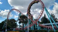
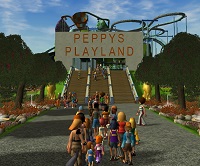
I would appear that I have some good competition. Good luck to all who entered!
Add me on any of these sites!
Steam: XGN | Maverick360
Discord: Maverick360 #6799
Gmail: [email protected]
Youtube: Maverick360
Oct 31, 2017, 03:08 PM
(This post was last modified: Oct 31, 2017, 03:10 PM by BlazingEmpireHD.)
Oh, this looks to be a closely heated battle between The Atomizer and The Poltergeist! Both look like quite good entries. The other two are decent, they had some good things about them. The clear battle is between the two I mentioned.
Good luck to all entrants this round!
Resuming regularly scheduled programming!

moderator
Coaster Enthusiast
CC time:
Titanic - You aren't going to win rounds by slapping scenery on (or over in this case) an unrealistic coaster, especially when it looks like the point of the scenery was to block our view of the layout. The large ship floating in space over the ride is there for no reason other than to try and give this entry some sort of theme, and the layout is just a bunch of helixes strung together. Study real coasters of the type your working with and emulate their layouts, and if you're going to give your ride a wacky theme (like building it around the Titanic) it would probably benefit the project more to A. put the ship in a body of water, and B. scale the size of the ship up so that the layout is contained within the ship.
If you would have made a small indoors coaster that was placed inside the hull of a ship that resembled the Titanic this entry would be much better.
The Atomizer - When I first read the title I thought this was going to be a rework of the RCT3 prebuilt coaster, I'm very happy to see I was wrong! The layout is short and sweet, although I think it could have been a tad bit longer and perhaps even have included a small loop, overall though this is a pretty solid NL2 entry.
Red Venom - The description says it all, a throwaway entry.
The Poltergeist - Another masterfully built RCT2 entry, not really much I can critique here. The only visual issues all stem from the game having clipping issues so that's not an issue really... My only suggestion for the future is to add footers where possible, I know this was a completely NCSO project (just from looking at it), but footers would just help add an extra level of realism to the project.
My vote went to the Poltergeist in the end, perfect timing for a Halloween themed entry.
Team CoasterTech
Vote goes to Poltergeist. Couldn't agree more with you Chris. Happy Halloween everyone!!!
4 Build it Wins!!! Thanks to everyone who voted for me!!!
Current Project: Learn how to use Parkitect

Interesting set of entries...
RMS Titanic- The Titanic had 4 smokestacks so it's not historically accurate, but the ship is really impressive and well made. That said, this isn't a winner. There's no rhyme or reason to the layout, and the one large structure does not constitute theming, especially since there's no trees/terraforming/water features/ other scenery to complement the ride or tie it in with the Titanic.
Atomizer- A creative concept, if not very realistic. I like the name, it ties in well to how small the coaster is and the layout is decent for its size. That said, the scenery is rather minimal and the train comes a little too close to the corner of the station on the first turn.
Red Venom- A throwaway as the description says, but at least there's a bit of effort with terrain and foliage, even if the scenery and buildings need work. A POV would've been nice.
Poltergeist- Best entry in the round by a country mile. Stellar scenery and terrain work, a solid layout, and great theme. No complaints.

My CC:
#1: RMS Titanic
As a fan of the history of Titanic I really wanted to love this entry. And I do think it's cool, however you could have done so-much-more! Chris is right the structure seems to be floating over the station which gave it an unrealistic look. With not too much work you could've placed the ship in a way that it would look in place with the rest of the track. This is not a "bad" entry I just feel like with a little more work you would've nailed it. The helixes were a bit much (too many). As OffbeatToaster mentioned there were four smokestacks on the real Titanic which is actually the first thing I noticed about your structure. I would love to see this project reworked and reposted I feel like it has potential.
#2: The Atomizer
I don't know much about No Limits 2 or its platform but I love the idea of major coaster company building a mini version of their flagship coaster design for smaller parks or to be placed on a temporary foundation like at a World's Fair setting. It looks really realistic and I absolutely love the color scheme!
#3: Red Venom
Even though it was supposed to be a quick fix to the stall in this round of build it, I actually think this could've been a really cool project if it had been finished with scenery and CS etc. The coaster itself has potential and I'd love to see this updated in the future.
#4: The Poltergeist
I pretty much knew as soon as I saw the screenshots who created this project and I always love your designs! There's always something new to see in every inch of the pictures. I'm a fan! Love the timing of this at Halloween and I'm a sucker for any horror themed projects. This is a great entry! Love everything about it and was really considering clicking the vote button but kept going back to The Atomizer (those colors man). It was a really tough decision this round for me but in the end...
I voted for The Atomizer.
Best of luck to everyone! Thank you all so much for your entries!

A nice round. Here are my thoughts.
RMS Titanic: Others have pointed out the weak execution, but I'd like to add a little suggestion here: making ships with the in-game monorail track layered one after another works several-fold better than using vanilla scenery pieces. I suggest looking into that idea if you want the ship to look more convincing. The scale, as has been pointed out, could have been made much larger indeed, so as to contain the entire roller coaster inside it. Then again, since the coaster is coming in and out of the ship here and there, I assume you wanted that concept intentionally. If you wanted to go the extra mile, maybe trying to make the ship on a 1:1 scale, and creating an entire theme park with a focal roller coaster within the ship (or even on the surface) would have been absolutely stunning to see. Still, this isn't exactly terrible, just a very simple entry with the execution coming no closer to the core idea.
The Poltergeist: The better of the two RCT2 entries for sure. Although the actual images are marvellous, I also really appreciated the accompanying description. Being a spooky/Halloween-themed entry, I'm sure it'll be favoured a lot for its perfect timing in this round, too. While I wouldn't put this next to Falco di Ferro from the last round, it is certainly just as ambitious. The attention to every necessary detail: the terraforming, the foliage, the architecture, the interactivity with the environment; very masterfully done. This is a very wholesome entry that ticks all the boxes of a well-done piece of RCT2 work. The purple-tinted windows, the trackitecture curved roofs and the castle scenery objects make an amazing combination that gives off an almost Castlevania-vibe in places. The only issue I have is the end result is particularly chaotic in certain areas (the 1st screen out of the 19, to be specific). A little effort to look out for that in the early stages of creating this entry could have alleviated this a bit, as I don't think this chaos was intentional. If it was, it certainly achieved that effect, but I can't say it needed that. Nonetheless, a fantastic entry that might very well be one of the top 2 contenders in this round.
The Atomizer: Certainly a fantastic entry as well. Although I must confess I don't particularly have much love for NoLimits 2, it was a very pleasant one to browse through. The POV was short but smooth. I'm not sure how things work in NL2, but I'd also have liked to see day-time shots, as night-time can hide imperfections sometimes.Â
When it comes down to it, I'd vote for The Poltergeist. In an almost modernist fashion, it seems like the one that took the most effort to create out of the four. Maybe this is where my RCT2 bias shows (or lack of knowledge of NL2), so I will not be voting in this round. Good luck to everyone who has entered.
Currently working on a fictional Italian non-park. Expected release date: Soonâ„¢
![[Image: QLvoQOM.png]](https://i.imgur.com/QLvoQOM.png)

I don't want to give detailed feedback, so I'll try to resume everything fast:
RMS Titanic: The ship is well done, but it looks out of place. The coaster goes through it there and there and doesn't really benefit from it, as mentioned above. If you took advantage of the setting (in this case the boat) to make the coaster, for example making it indoor, it would be much better.
The Atonizer: I'm disappointed because it is very short, but it looks fun! The area around is cute and sweet, like a fairground, and I like it! Great execution in general and solid entry, although it could be better.
Red Venom: I'm listening to you, I'll not vote for your entry, but I think a few people will still vote for it since it doesn't look like a complete throwaway.
The Poltergeist: The perfect entry for Halloween, and it's probably the best entry of this round. A lot of interaction with the path and the other rides, great sense of details, a good composition in general and a very "spoopy" layout. You showed me your progress many times, and I know how the entire area looks like, but I would have liked that you also show the rest of it, like the other rides and buildings, since they are also part of the entry, rather than just showing what is very close to the track.
Poltergeist takes my vote. And good luck for the other entries!
Trying to make an inspiring park or coaster.
My CC
#1 RMS Titanic:
I can tell very clearly that dispite the ship being there it doesn't look like too much effort was put into it if this coaster was built ON the ship instead of THROUGH the ship that would've made a difference
#2 The Atomizer
This one was a close second for me I love the concept I just wish it was an RCT3 coaster
#3 Red Venom
This coaster needs work which I'd be happy to do. Mostly to do with the scenery surrounding it as already stated. But with only 2 screenshots it's hard to tell
#4 The Poltergeist
A great Halloween themed coaster and definitely the better of the two RCT2 entries. Again more effort was put into this than RMS Titanic. This for me was the winner.
Let's have a great round chumps!
![[Image: 59e9c54389846.png]](https://thumbs.rctgo.com/w540/h300/2017-10/17480/59e9c54389846.png)
![[Image: 59ea9e59e8e43.png]](https://thumbs.rctgo.com/w540/h300/2017-10/17482/59ea9e59e8e43.png)
![[Image: 59edfdcb6b707.png]](https://thumbs.rctgo.com/w540/h300/2017-10/17489/59edfdcb6b707.png)
![[Image: 59f7e898d3c72.png]](https://thumbs.rctgo.com/w540/h300/2017-10/17524/59f7e898d3c72.png)
![[Image: buildit.png]](https://rctgo.com/assets/images/headers/buildit.png)
![[Image: 1.png]](http://rctgo.com/assets/images/links/1.png)
![[Image: QLvoQOM.png]](https://i.imgur.com/QLvoQOM.png)